
Anas Rustom
Hi! I'm Anas :)
I'm a passionate Front-end Developer Web Designer Competitive Programmer Software Engineer
that loves crafting beautiful user experiences and learning new skills.

I am also an honors Computer Science student at Qatar University, consistently acing academics with a perfect 4.0 GPA and earning Dean's List recognition.
CSS
HTML
JavaScript
JQuery
React
Bootstrap
Java
Python
D3
Currently learning: Bash and Rational Databases
A robust study tool for optimum efficiency
A responsive NFT marketplace that lets users explore, filter, and discover NFTs.
Play against a TicTacToe bot that is impossible to beat!
A powerful calculator built with React.Js's useReducer.
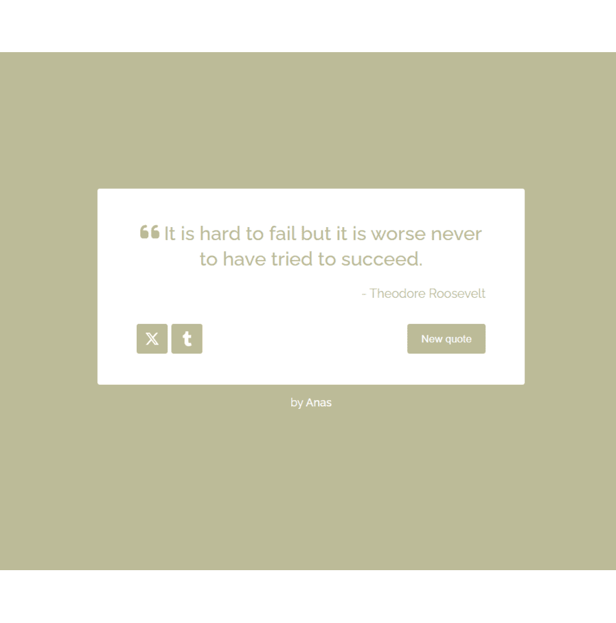
A generator that unviels a new inspiring and famous quote with every click.

A heat map that displays the monthly global land-surface temperature over the span of 263 years.

A bar chart that displays the United State's GDP over the span of 70 years.
Phone
+974 66294099
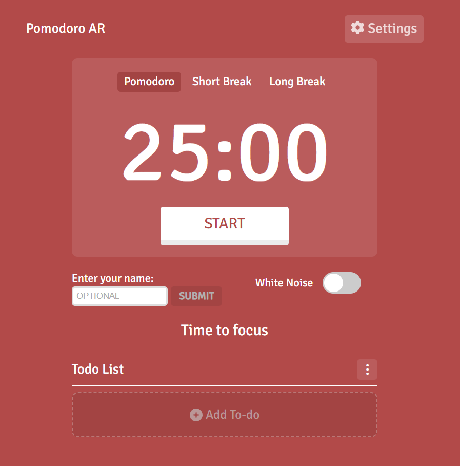
The Pomodoro Technique is a time management method developed by Francesco Cirillo in the late 1980s. It uses a kitchen timer to break work into intervals, typically 25 minutes in length, separated by short breaks.
The Pomodoro Web App blends JQuery, React.JS, HTML, CSS, and Javascript, offering a robust study tool. With features like a smooth toggle for white noise, sound options, volume control, and customizable app themes, it significantly optimizes study sessions. Furthermore, it has a dynamic task list feature allowing seamless task editing, addition, and deletion. Benefiting over 10 students, it stands as a testament to efficient time management and enhanced productivity in academic pursuits.

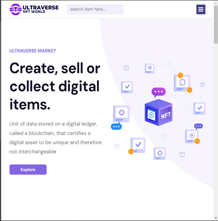
NFT marketplaces are specialized platforms that facilitate the buying, selling, and creation of Non-Fungible Tokens (NFTs), which are unique digital assets representing ownership of distinct and scarce items, both tangible and intangible.
Ultraverse, my React.js masterpiece, is a cutting-edge NFT marketplace born from the Front-End Simplified course. It's a responsive NFT marketplace where users seamlessly explore NFTs, filter based on preferences, and discover trending collections, top creators, and new releases. Thanks to collaborative debugging with Front-End Simplified interns, Ultraverse offers a sleek, userfriendly experience. Some features include the ability to follow favorite creators and view individual NFT details, making it a dynamic and engaging marketplace.

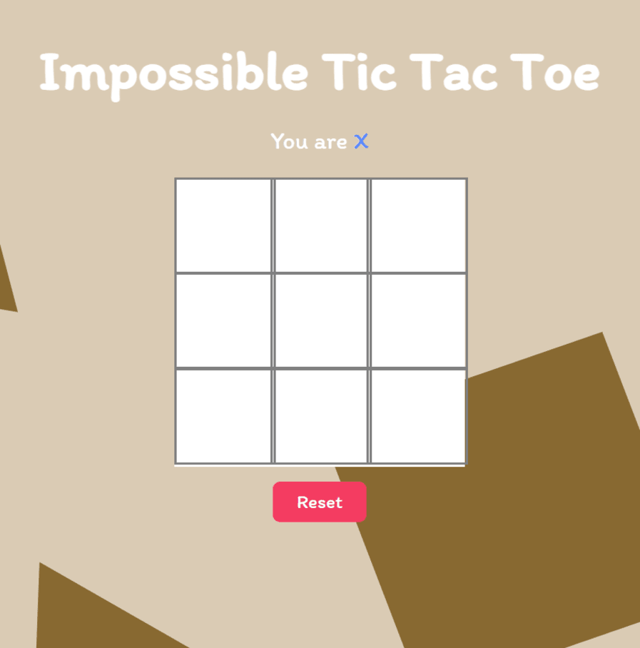
A simple TicTacToe game where you can play against an AI that is impossible to beat.
Explore my personal project, the "Impossible-To-Beat TicTacToe" web game. In this innovative creation, players consistently initiate the game against an AI that either secures a tie or wins. Leveraging strategic algorithms, this project showcases my skills in game development, artificial intelligence, and web design. The app offers an engaging and challenging experience, reflecting my commitment to pushing boundaries in web development and creating unique, unbeatable gaming solutions.

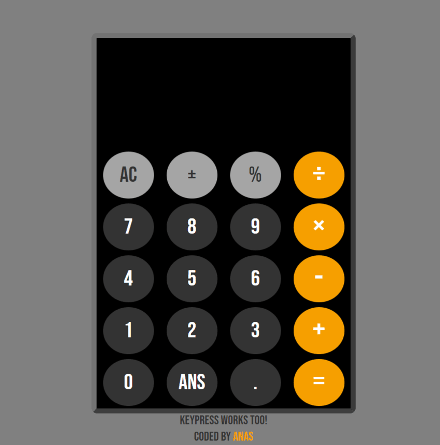
This React calculator with useReducer tackles complex operations and offers smooth keyboard or mouse input for a powerful user experience.
Incorporating React's useReducer, the Calculator Web App is a powerful tool for handling operations efficiently made with JQuery, React.JS, CSS, HTML, and Javascript. With support for both keypresses and mouse input, this application provides a seamless and responsive user experience. Discover a state-of-the-art calculator that leverages React's capabilities to enhance functionality and usability

A machine that unviels a new inspiring and famous quote with every click.
Dive into my "Random Quote Machine" project — a visually striking, responsive web design that delivers inspiration with every click. Explore a curated collection of quotes by famous figures, dynamically generated at the touch of a button. The added feature lets users effortlessly share their favorite quotes on Twitter or Tumblr, adding a social dimension to this engaging and user-friendly project. Witness my commitment to creating not just functional but aesthetically pleasing web experiences.

A data visualization heatmap is a like a colorful grid that uses intensity of color to represent values in a dataset.
Delve into Earth's climate history with this interactive D3.js heatmap. Unveiling a hidden dimension of time, it visualizes the subtle variations in monthly land temperatures across the globe, spanning a staggering 263 years (1753-2015). Witness the ebb and flow of our planet's thermal fingerprint, and uncover potential trends hidden within the vast tapestry of climate data.

A data visualization bar chart is a graph that uses rectangular bars to represent values in a dataset. Each bar's length is proportional to the value it represents, allowing for easy comparison between different categories.
Explore the rise of a nation through this dynamic D3.js bar chart. Unveiling the story of American economic expansion, it translates raw data into a visually compelling narrative, showcasing the United States' Gross Domestic Product (GDP) from 1946 to 2015. Each bar represents a year, its height revealing the economic pulse of the nation. This interactive visualization offers a glimpse into decades of growth, prosperity, and potential turning points in the American economic story.